Reco Capey in Yardley’s design studio. (Design Council Archives)
Reco Capey (1895-1961) had one foot in industry and the other in the crafts and his career illustrates the emergence of the design profession out of the applied arts. He was born in North Staffordshire and, as was usual for young people with artistic talent, he was apprenticed to the pottery industry. He produced intelligent designs at Burslem art school and did similar work for Doulton. He went to the Royal College of Art in about 1921, where he studied under Dora Billington, another artist from North Staffordshire.
Glazed tiles made at Burslem art school, 1916.
Ceramics for Doulton, 1920s.
After he graduated from the RCA, William Rothenstein asked him to set up a new textiles course. He was one of a group of young teachers and students – including Barbara Hepworth, Henry Moore, Paul and John Nash, Eric Ravilious and Edward Bawden – who introduced advanced ideas to what was still a fairly conservative college.
From ‘The Printing of Textiles’.
Capey’s course concentrated on printing and covered hand-block and machine printing, contributing to the advance of both craft-based and industrial textile design. The course content, with its solid grounding in materials and methods, is recorded in his book The Printing of Textiles (1930). His students included Lucienne Day and Astrid Sampe, who became a leading textile designer in Sweden and adopted his teaching methods.
Rothenstein’s principal ambition was to elevate the teaching of painting and sculpture at the RCA and, although there were more design students at the college than fine artists, commercial art was rather looked down on. When Rothenstein took up his position in the early ‘twenties he made a tour of continental art schools but omitted the Bauhaus. Capey was one of the few tutors to introduce Bauhaus ideas to the RCA and the only one to call himself an industrial designer.
At the same time as he was teaching, Capey was chief designer for Yardley Cosmetics. He spent a couple of years as an adviser to the Rural Industries Bureau and he was an active member of the Arts and Crafts Exhibition Society. In 1928 he showed lacquered boxes and printed fabrics at the Society’s exhibtion alongside textiles by Phyllis Barron, Enid Marx and Ethel Mairet.
Filigree metal doors to Yardley’s Bond Street Shop, 1933. (Architectural Press Archive/RIBA Collection)
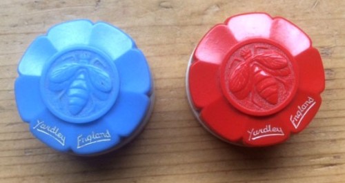
In 1933 Yardley moved its retail operation to a new building at 33 Bond Street, to which Capey had made significant contributions, notably its doors and a frieze above the fourth storey. He is credited with designing the company trade mark, the Yardley bee, but his ex-wife, Katherine Bertram, who also worked for Yardley, said it was her design and that Capey failed to acknowledge her contribution.
Katherine Bertram’s bee design for Yardley, for which Reco Capey took credit.
Capey became involved with the Arts and Crafts Exhibition Society at the time when it was struggling to find an identity for itself and when there was strife between modernisers, who thought it had to adapt itself to modern industry, and conservatives, who wanted it to serve craftsmen working by hand and to have nothing to do with machinery. He became its president in 1940 when the dispute was at its height, and it’s significant that at that moment it was thought that an industrial designer was an appropriate person for the post. But he was unable to contribute to the debate because he was immediately transferred to Yardley’s New York office.
His view of craftsmanship was actually fairly similar to that of other members on the modernising wing: machine production was unavoidable but civilisation couldn’t exist without craftmanship; the manufacturer depends on the craftsman and it’s not possible to create anything of value without a thorough knowledge of materials. But he also believed, unlike many members, that in contemporary society it was no longer possible for the designer to be a maker. In Capey’s absence, John Farleigh took the chair of the Society, but although he was also a moderniser he wasn’t prepared to confront the traditionalists. It’s interesting to speculate what Capey, who was much more engaged with commerce than Farleigh was, would have done if he’d remained in England.
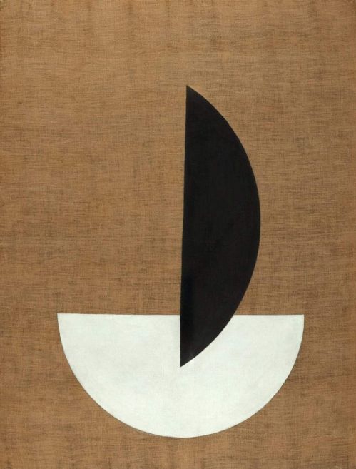
The Road to Uppsala, 1937
Containers in epoxy resin, exhibited in 1935.
As a result of his experience in desiging packaging for Yardley, Capey became interested in new materials and in the Royal Society of Arts’ 1935 exhibition, British Art in Industry, he showed containers made in the newly-invented epoxy resin. He showed them again at the Arts and Crafts Exhibition Society in 1938, when it had finally been decided to include designs for industry, the boldest contributions to the exhibition that year. He was an early Royal Designer for Industry.
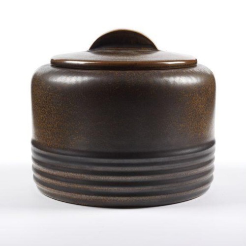
Stoneware jar and cover, made by Doulton c. 1935 (Victoria & Albert Museum).
Although most of his work was in the USA after 1940, he remained a UK resident and maintained his association with the RCA until 1953 as an external examiner. He made many visits to Sweden, whose design culture he had a high regard for. But his own contribution appears to have fallen off after the war, and at the end of his career he was designing some truly awful things for Yardley.
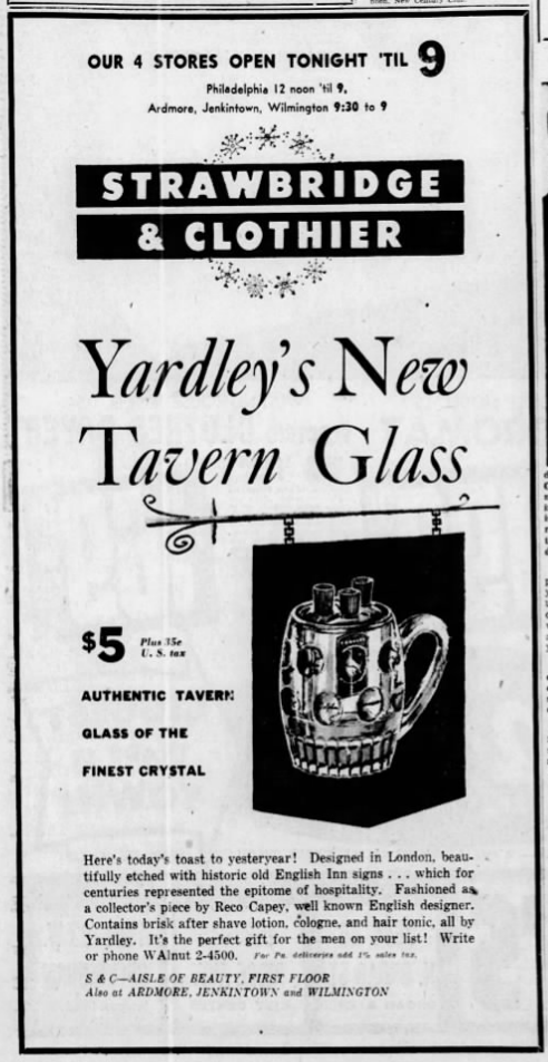
“A collector’s piece by Reco Capey, well known English designer.”
An advert in ‘The Philadephia Inquirer’, 14 December 1953.
The best source of information about the RCA in this period is Hilary Cunliffe-Charlesworth’s unpublished PhD The Royal College of Art: It’s Influence on Education, Art and Design 1900-1950. The information about Katherine Bertram is from Isabella Stone, who maintains a website about her and kindly answered my questions. Christine Dove, of the Society of Designer Craftsmen, did some very helpful background research. I tried to find out if Yardley had an archive but they do not answer questions about the company.